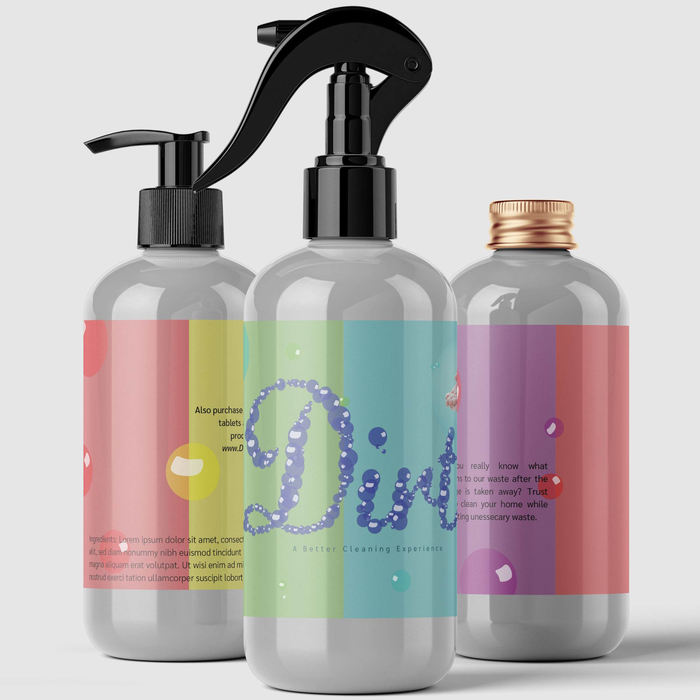

Dirt is a sustainable cleaning brand created in response to the COVID-19 pandemic and growing plastic waste. By offering dissolvable cleaning tablets and reusable spray nozzle attachments, Dirt transforms everyday glass jars into functional cleaning bottles, reducing reliance on single-use plastics. The brand identity extends across bottle labeling, tablet packaging artwork with a custom dieline and cut-and-fold specifications, and promotional posters, creating a cohesive visual identity centered on sustainability and reuse.
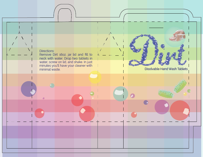
Flat packaging artwork featuring a custom dieline, cut lines, fold lines, and panel layouts prepared for print production and assembly.
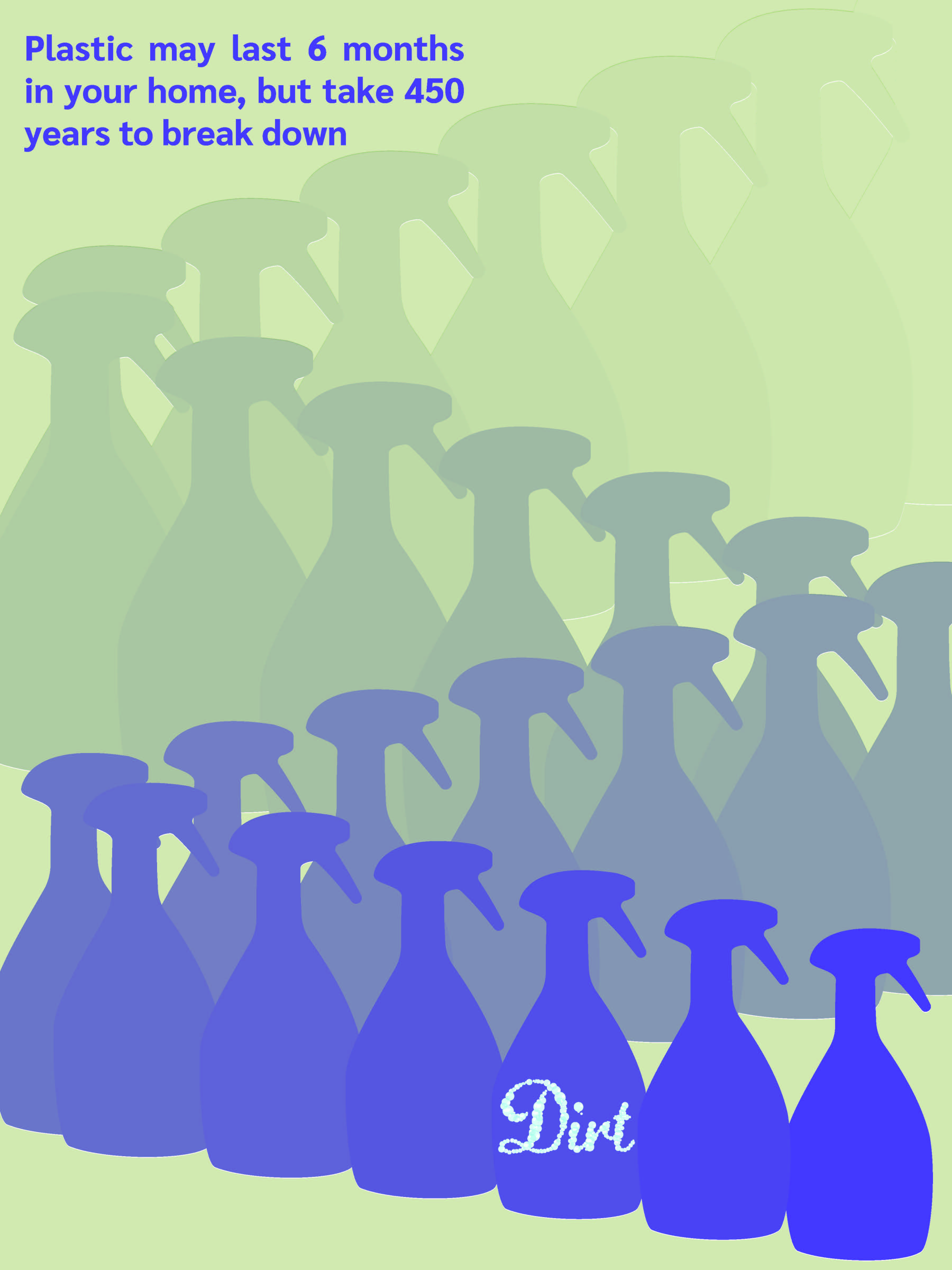
Promotional poster design extending the Dirt brand identity.
Future Avenue is a conceptual transportation service connecting homeless and at-risk youth in rural communities with essential resources. With an onboard social worker, the service provides transportation, guidance, and support for youth and their children, helping overcome barriers to accessing critical services.
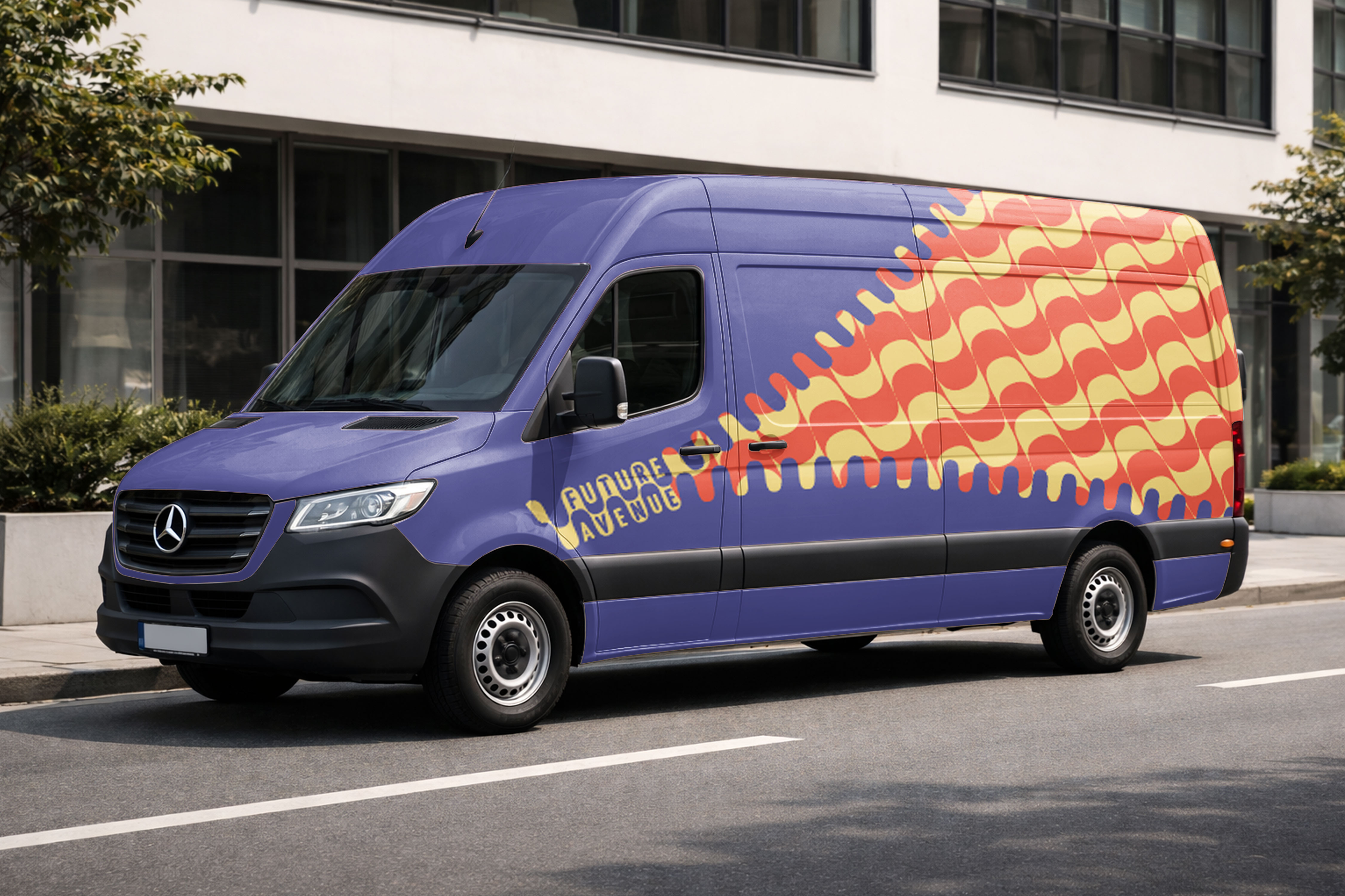
The Future Avenue van serves as both transportation and a mobile representation of the brand, creating a recognizable, approachable presence while connecting vulnerable youth with essential services..
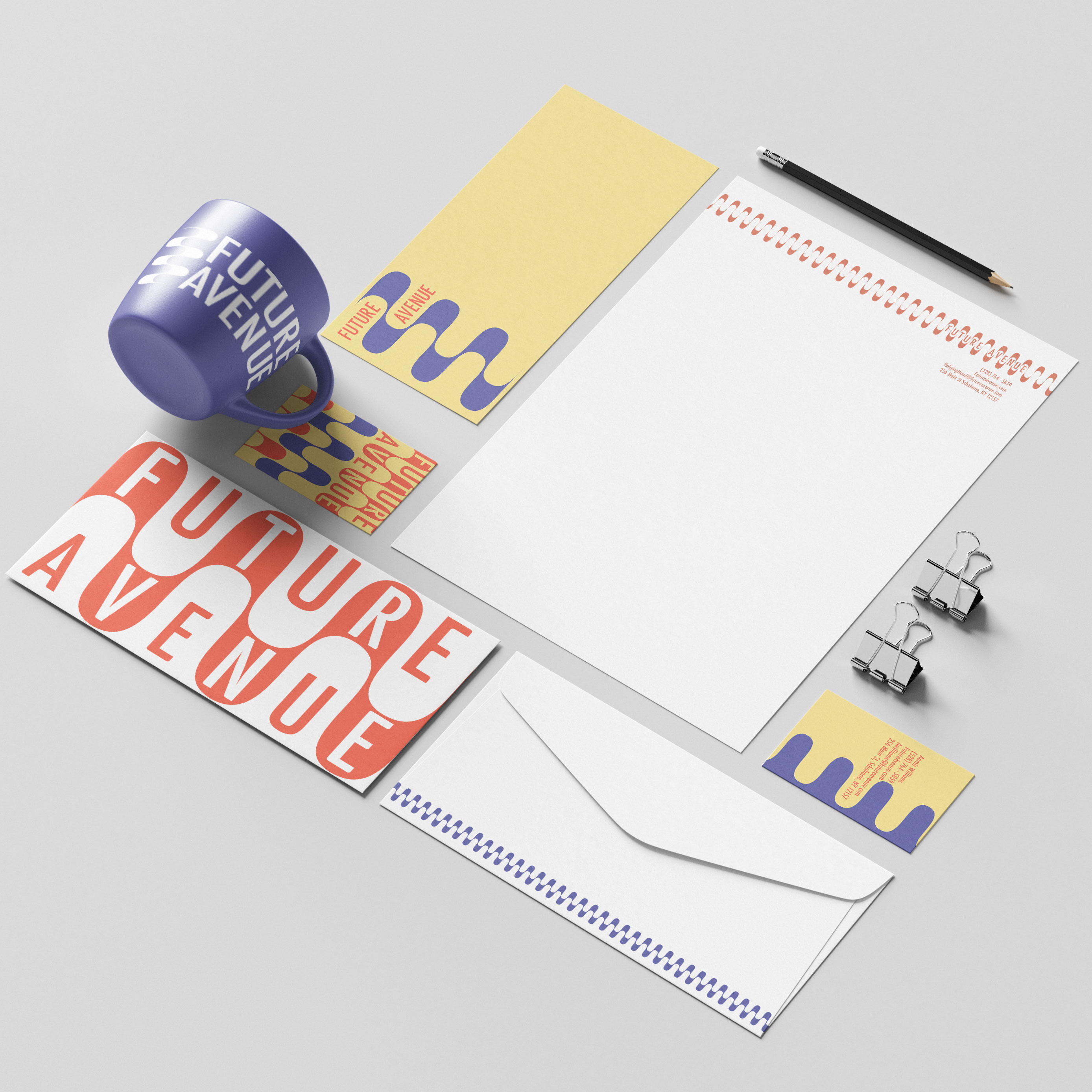
A cohesive stationery system featuring business cards, letterhead, and envelopes reinforces Future Avenue’s identity while supporting professional communication with community partners and service providers.
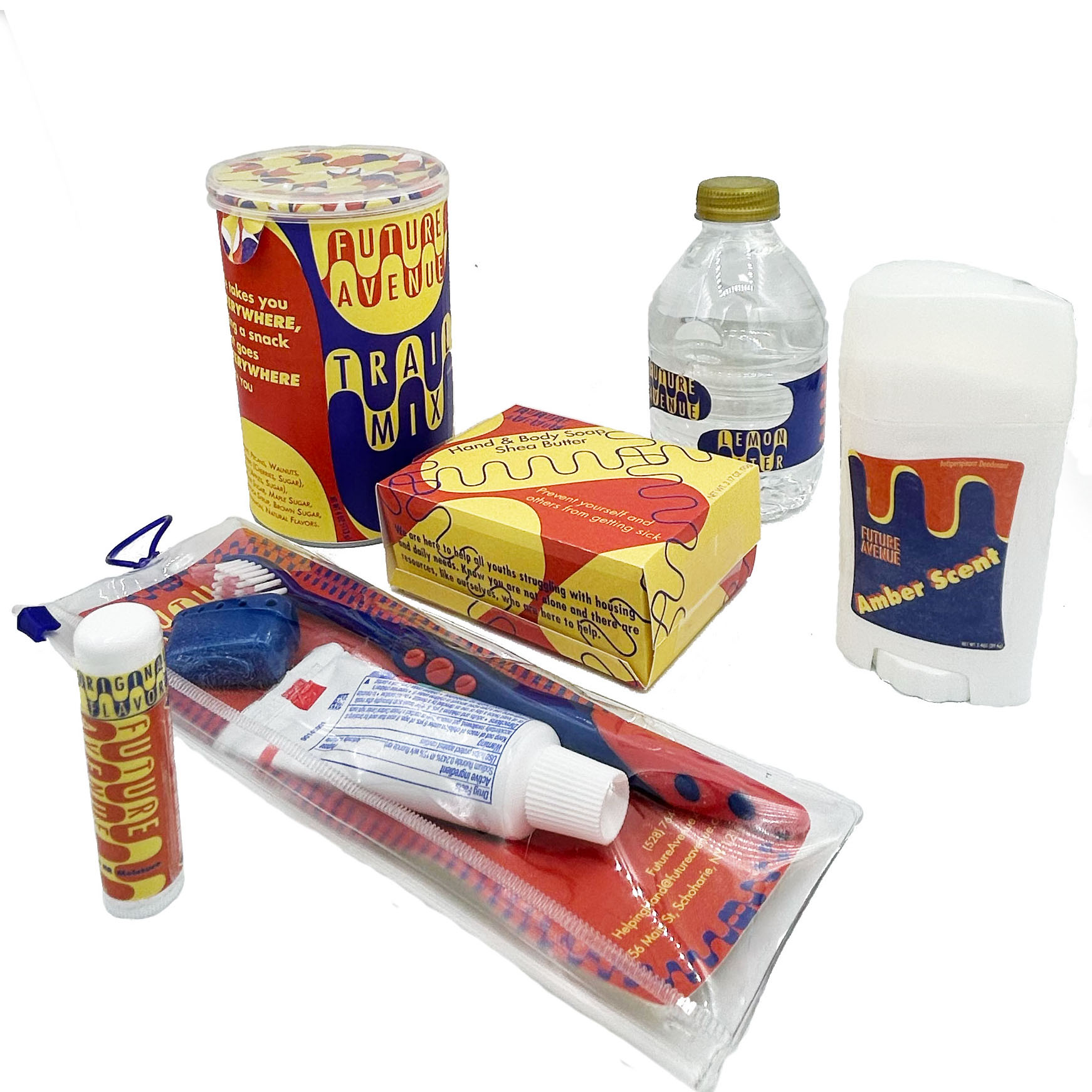
Rather than traditional advertising, Future Avenue distributes branded necessities such as food, water, toothpaste, and household supplies. These everyday essentials provide immediate support while building awareness through resources that at-risk youth can use and share.
Green View Ranch is a conceptual wedding venue brand combining rustic elegance, equestrian experiences, and environmental sustainability. The project develops a cohesive visual identity for a ranch-style destination wedding venue, extending across brand strategy, packaging, website design, and wedding stationery.
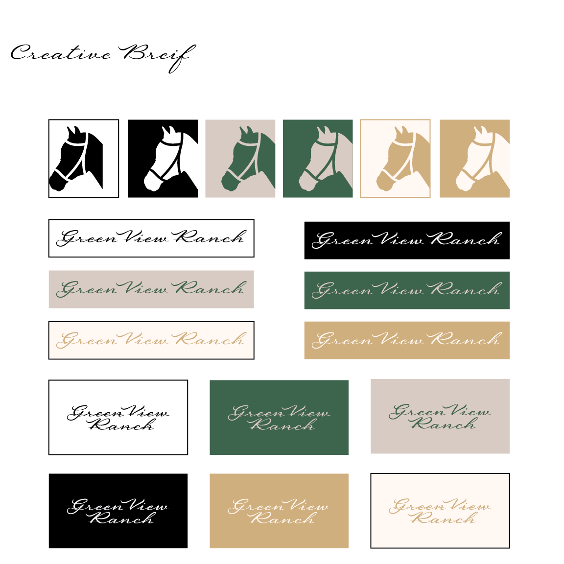
Initial exploration of the Green View Ranch identity, featuring a stylized horse emblem, script wordmark, and variations across the brand's natural color palette.
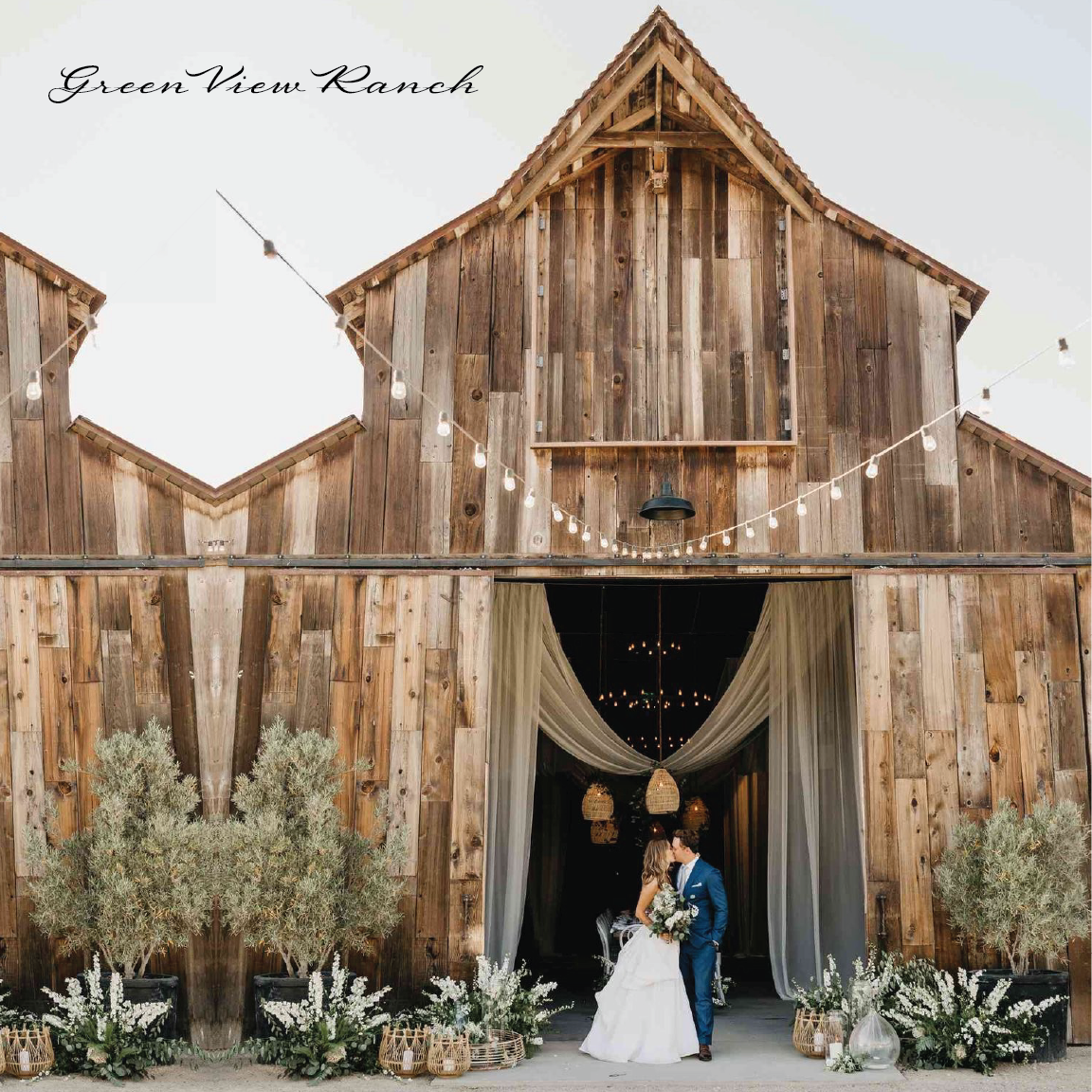
A rustic wedding destination centered around restored barns, romantic landscapes, and traditional equestrian experiences. The visual direction combines natural materials with an elegant atmosphere.
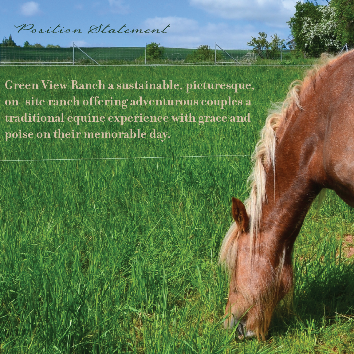
Green View Ranch positions itself as a sustainable, picturesque wedding destination offering adventurous couples a traditional equestrian experience with grace and poise on their memorable day.
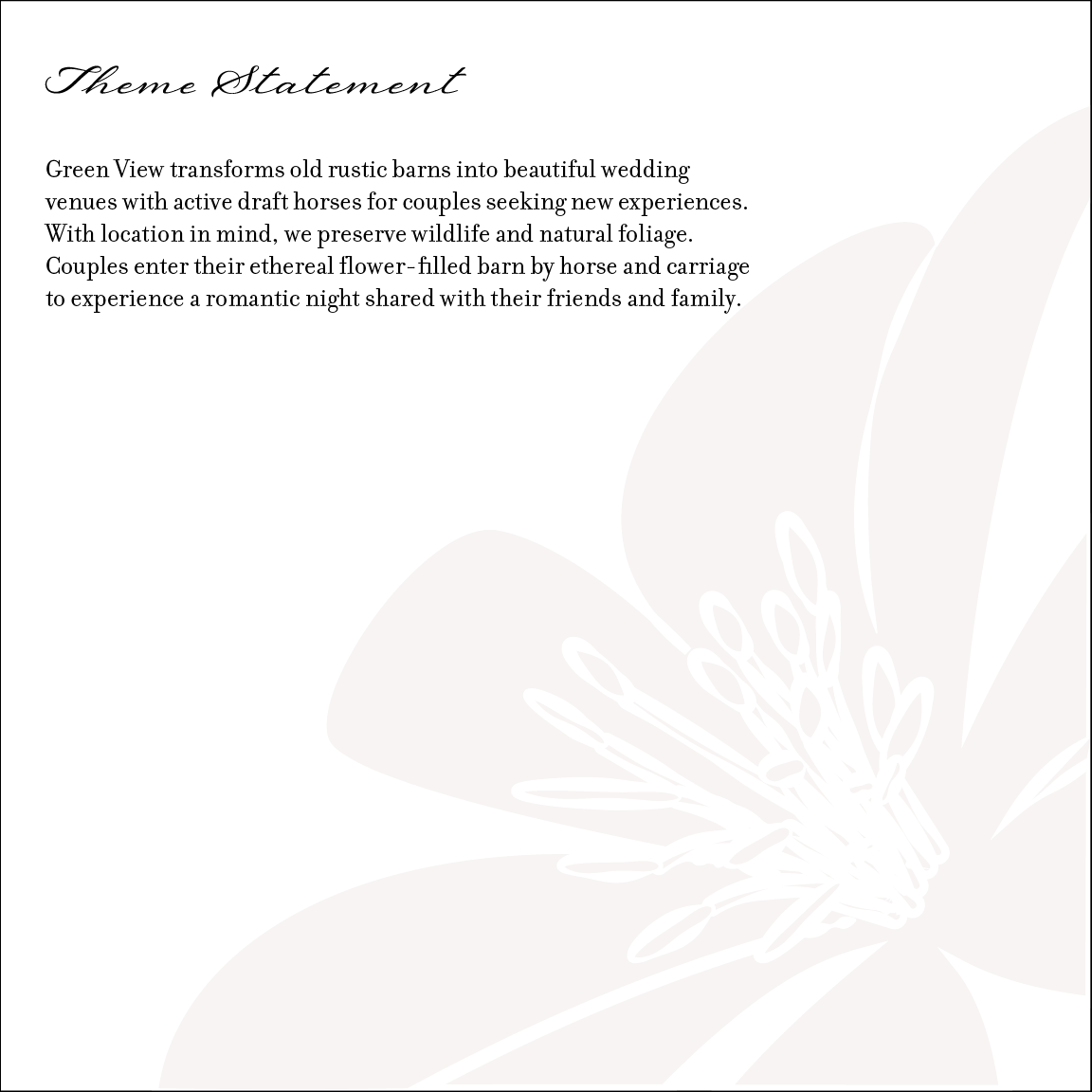
The brand transforms existing rustic barns into elegant wedding venues while preserving natural foliage and wildlife. Horse-drawn carriage arrivals and flower-filled spaces create a distinctive romantic experience.
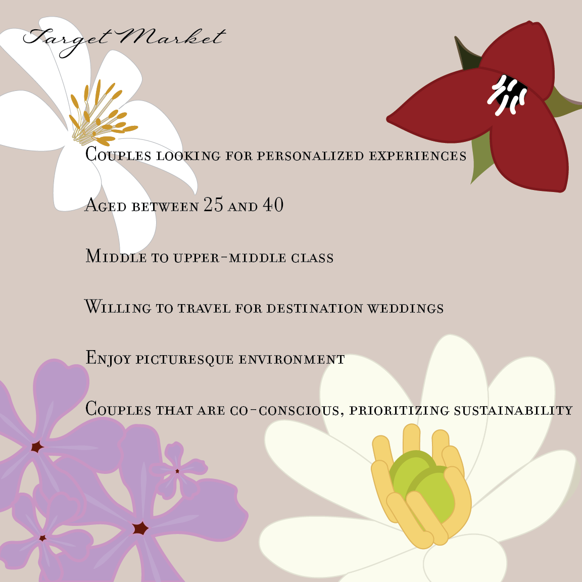
The intended audience includes couples ages 25–40 seeking personalized destination weddings, picturesque surroundings, and environmentally conscious celebrations.
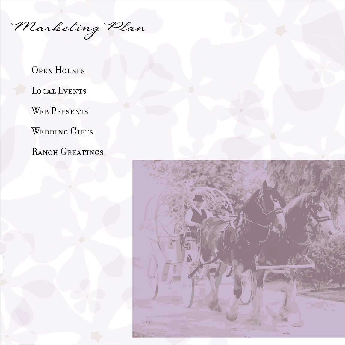
The marketing strategy emphasizes open houses, local events, a web presence, wedding gifts, and ranch gatherings. These touchpoints introduce prospective couples to the venue's distinctive atmosphere and experiences.
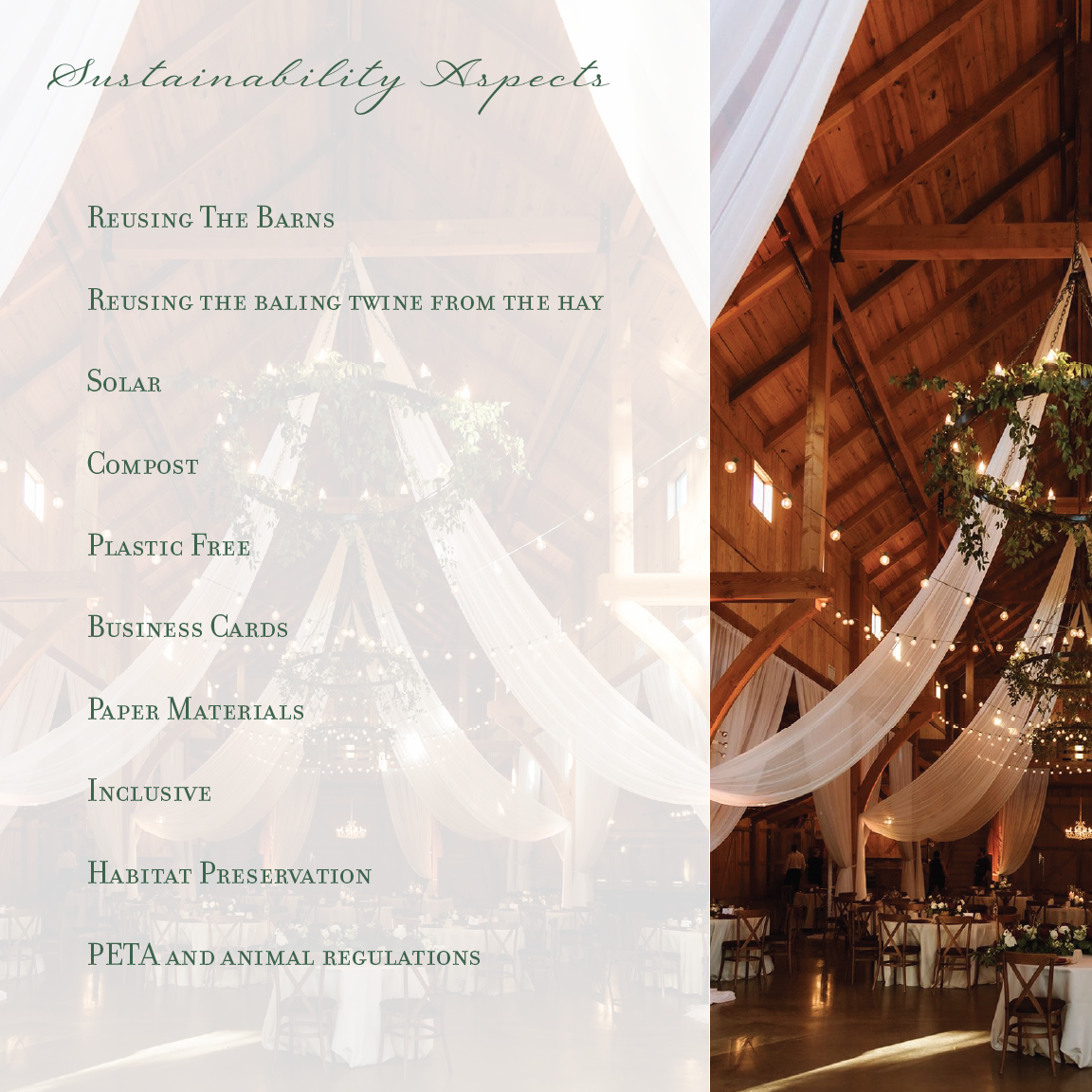
Sustainability is integrated into the brand concept through adaptive reuse of barns, repurposed materials, solar energy, composting, reduced plastics, and habitat preservation. These values shape the venue's identity and operations.
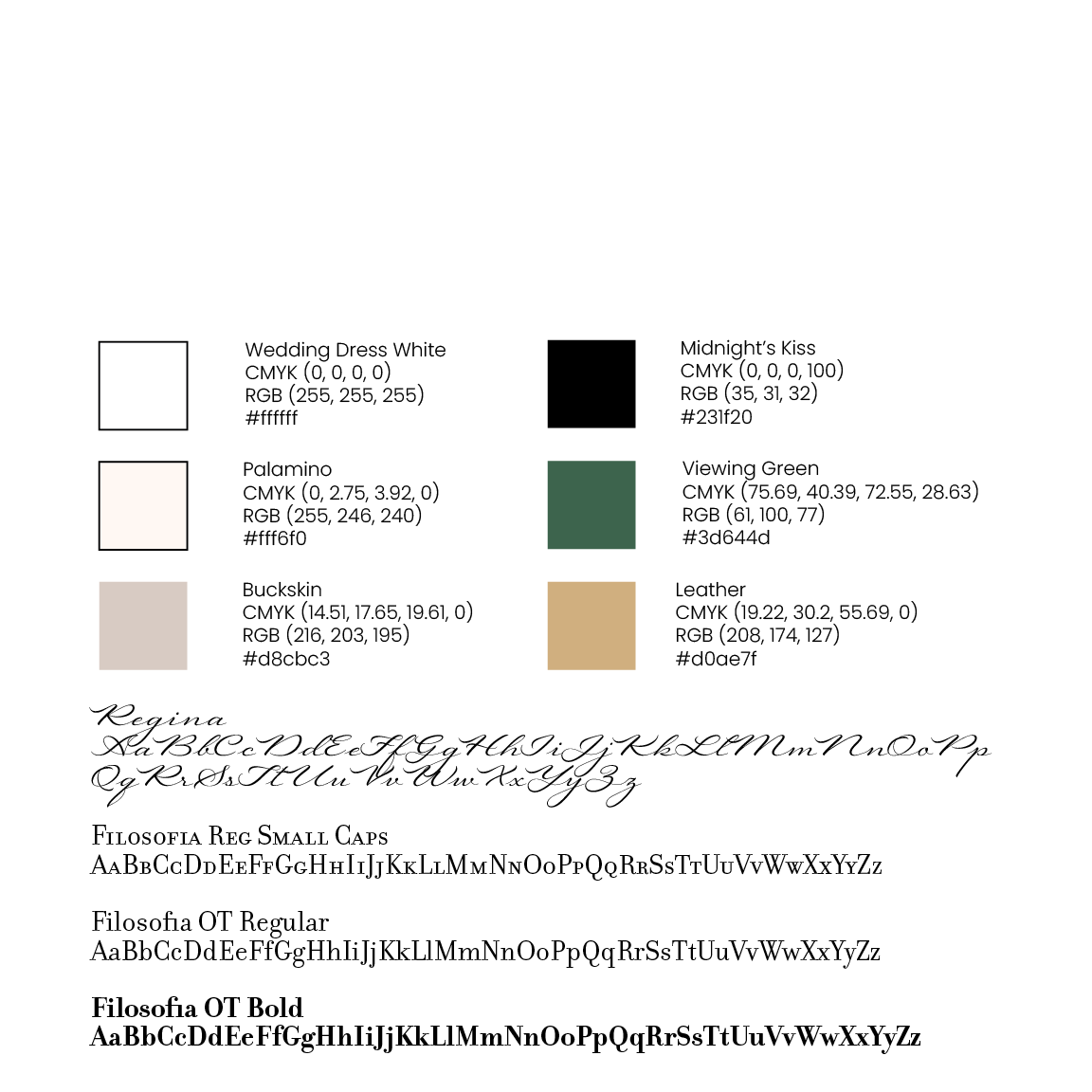
A coordinated visual system featuring Regina script and Filosofia typography, supported by a palette of Viewing Green, Buckskin, Leather, Palomino, black, and white. Color specifications establish consistency across print and digital media.
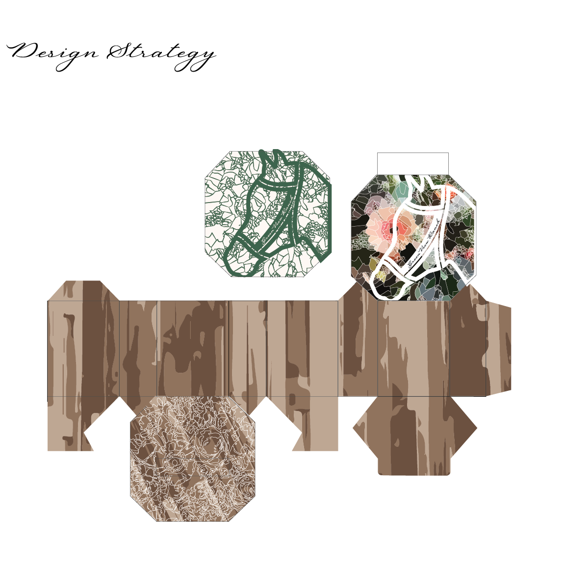
Custom floral packaging artwork developed using a dimensional box dieline. Wood textures, botanical illustrations, and the ranch's horse emblem extend the identity into a tangible branded presentation.
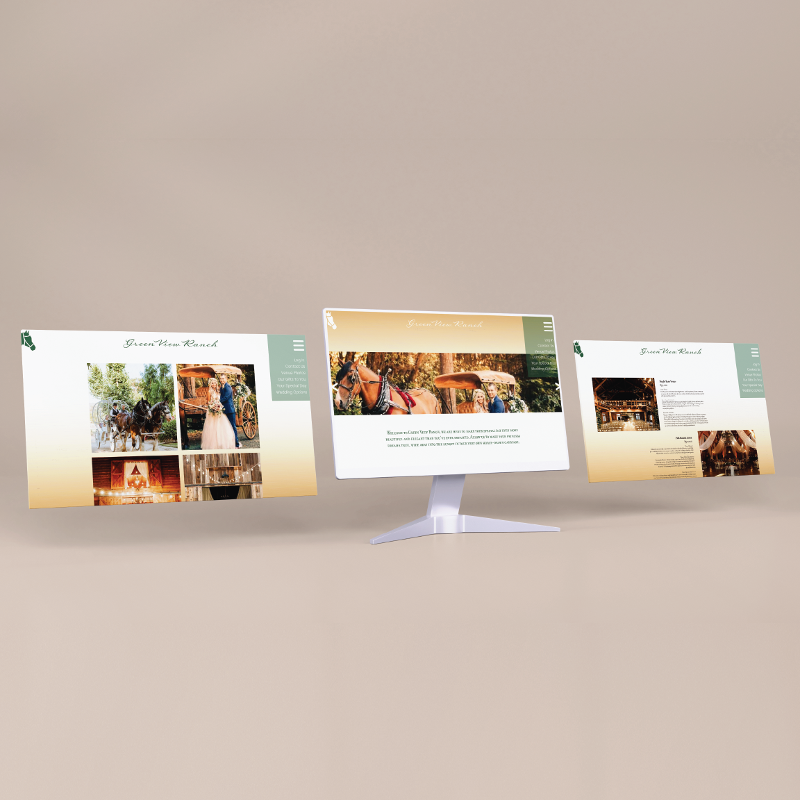
A website concept presenting the venue's photography, equestrian experiences, event spaces, and wedding services. The digital design carries the brand's typography, natural color palette, and rustic elegance into an accessible online experience.
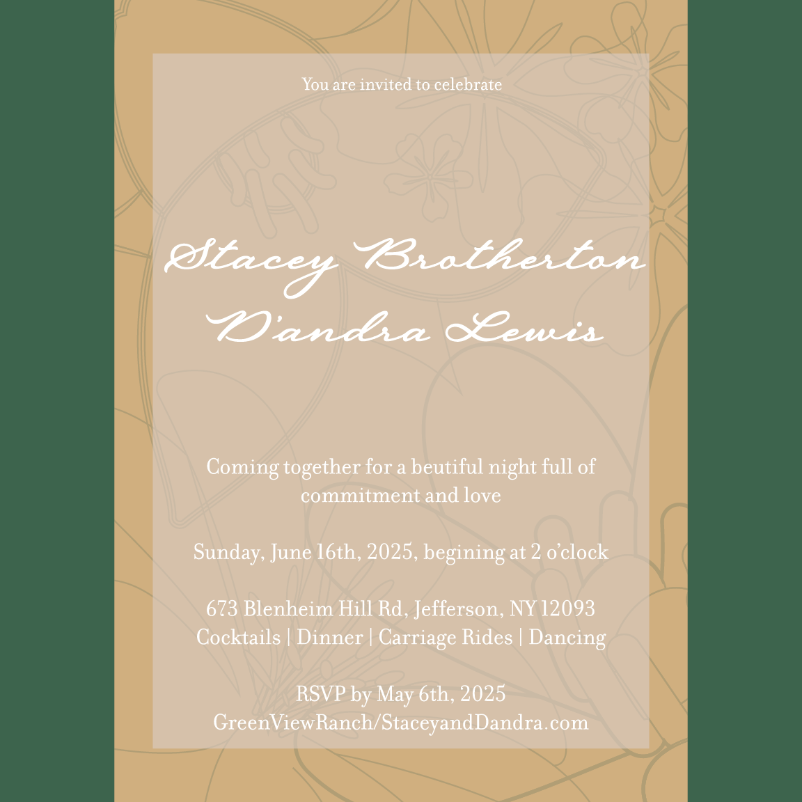
A wedding invitation incorporating delicate botanical linework, elegant script typography, and the brand's signature green and gold tones. The design demonstrates how the identity translates into personalized wedding stationery.
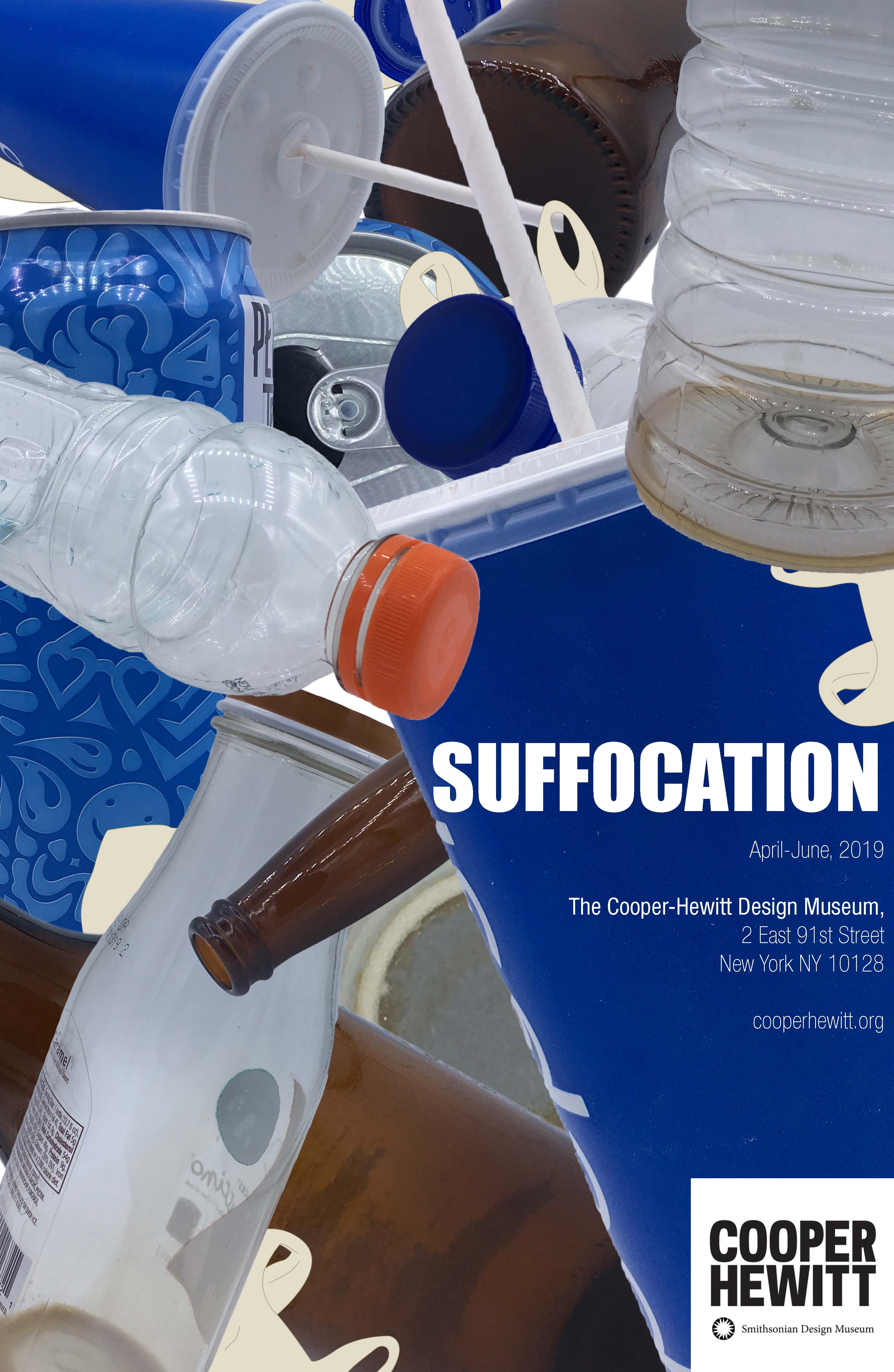
A conceptual gallery poster designed for the Cooper Hewitt Smithsonian Design Museum. Through striking imagery and visual symbolism, the poster explores the impact of pollution and declining air quality, highlighting the growing threat to human health and the environment.
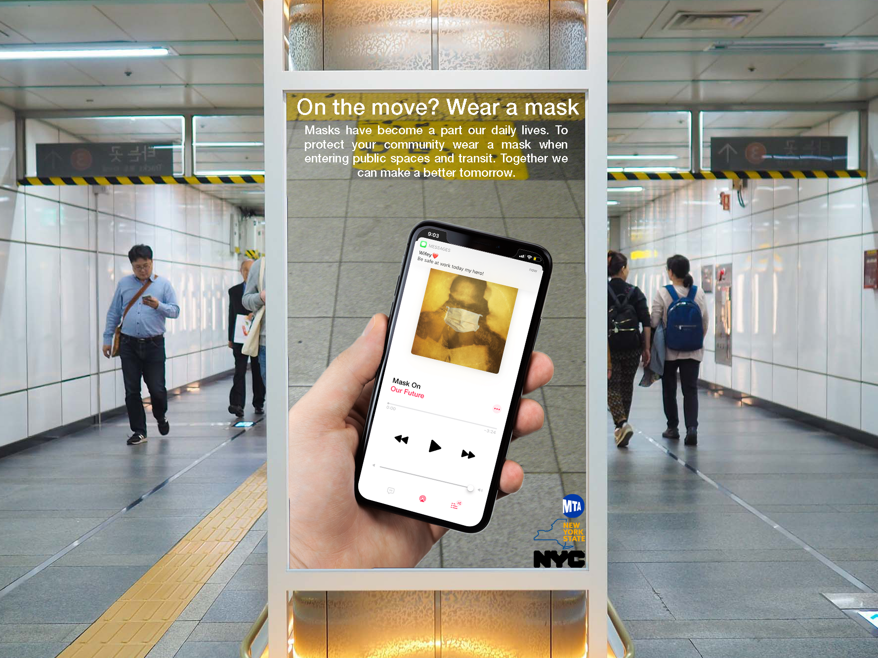
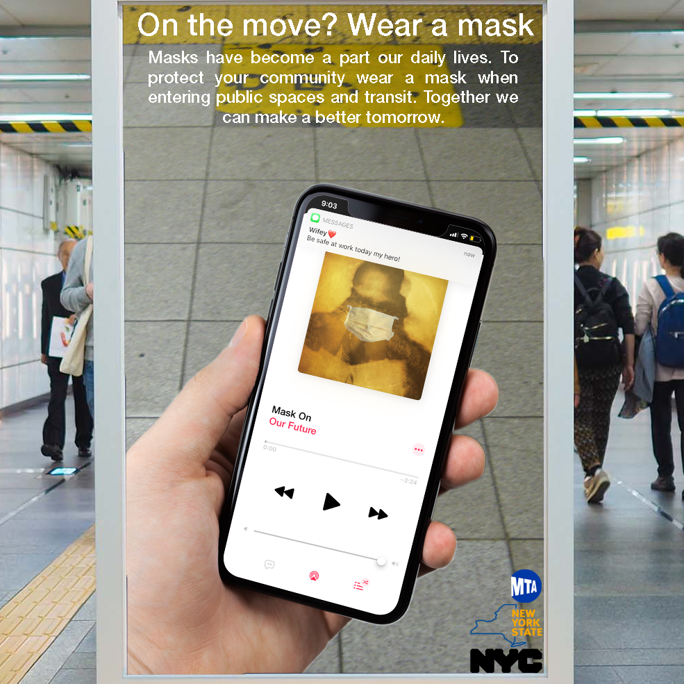
Created during the COVID-19 pandemic, this conceptual poster reimagines Future’s song “Mask Off” as “Mask On,” using Apple Music’s interface to emphasize the importance of wearing masks to protect our future.
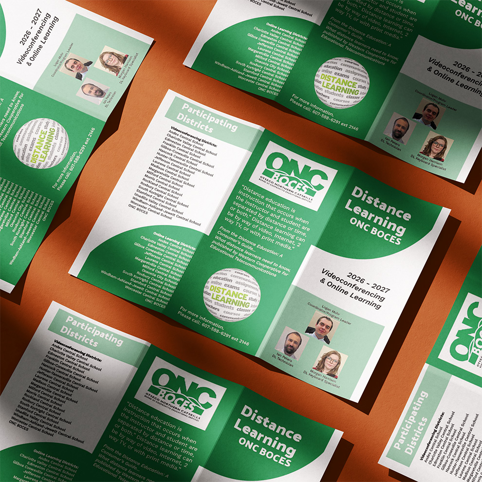
A collection of print and digital marketing materials developed to promote ONC BOCES Distance Learning programs and communicate educational opportunities to school districts, educators, and students.
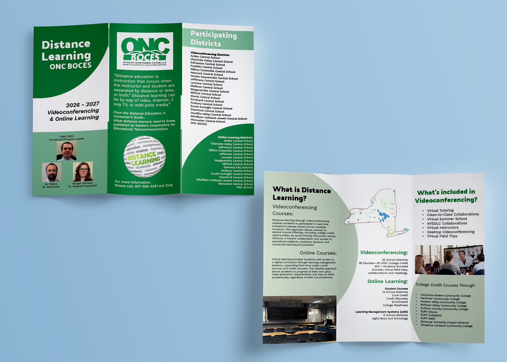
A six-panel trifold brochure showcasing Distance Learning programs and services through organized layouts, clear information hierarchy, and consistent institutional branding.
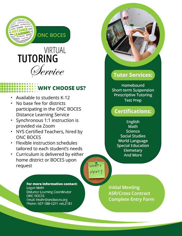
An informational flyer highlighting virtual tutoring services, program benefits, and instructional opportunities through a clear, accessible layout.
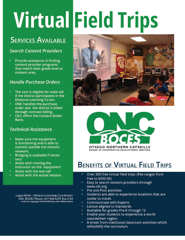
A promotional flyer combining engaging imagery and program information to encourage educator participation in virtual field trip opportunities.
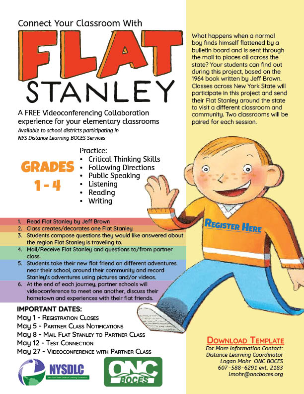
A colorful promotional flyer using playful illustrations and accessible instructions to encourage elementary classroom participation in an interactive learning experience.
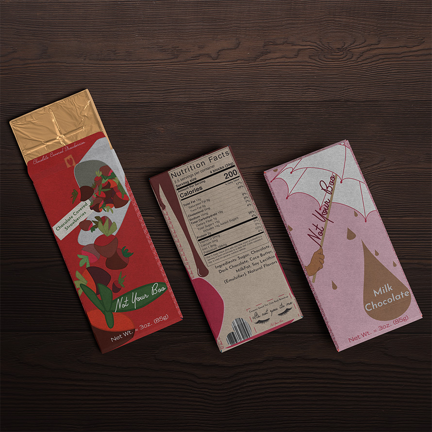
Not Your Boo is a conceptual anti-Valentine's Day chocolate bar collection that puts a humorous twist on traditional romantic gifting, with each bar featuring a coupon redeemable for one bad breakup.
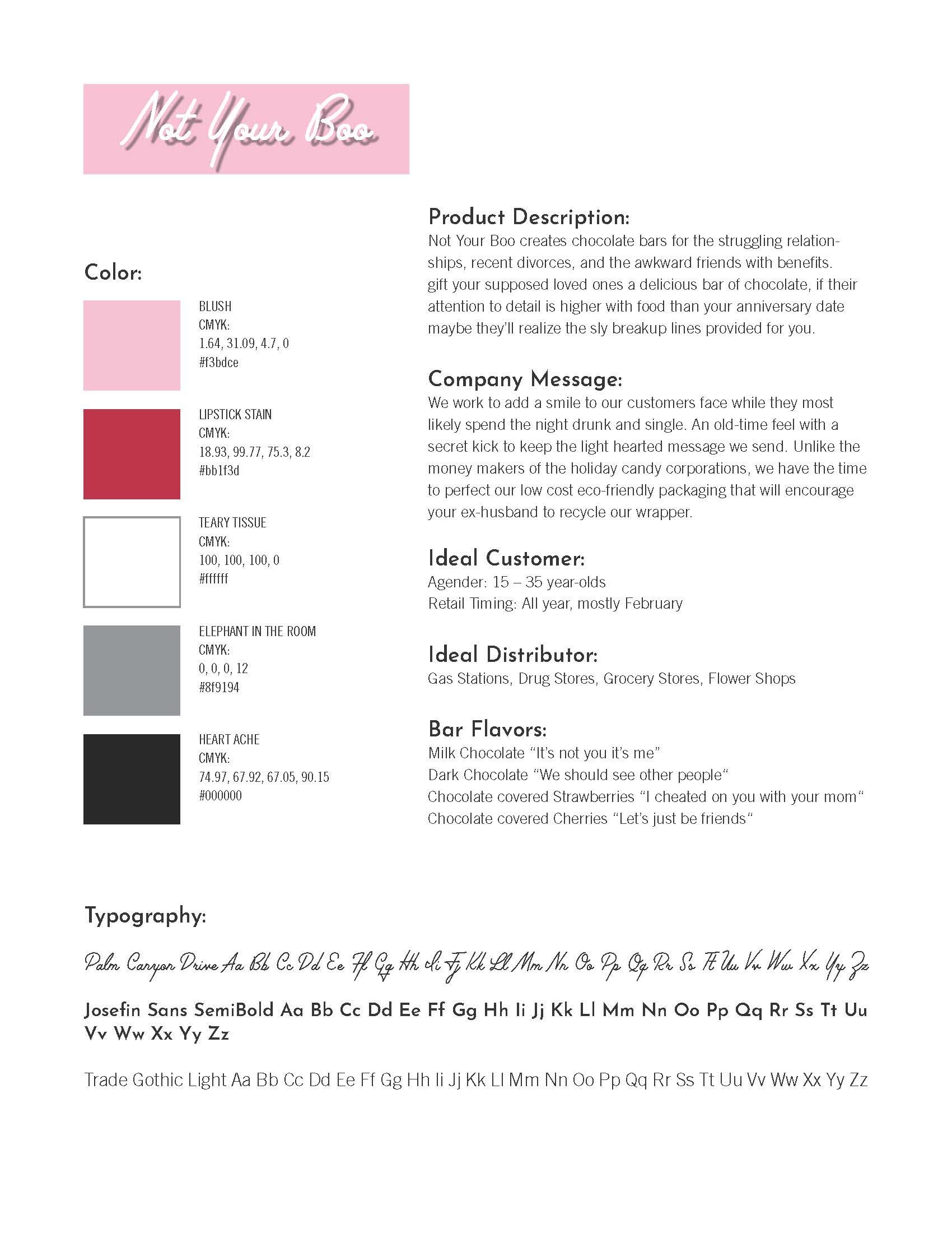
An unconventional chocolate bar concept challenging traditional Valentine's Day marketing through playful messaging, bold graphics, and a cohesive product identity.
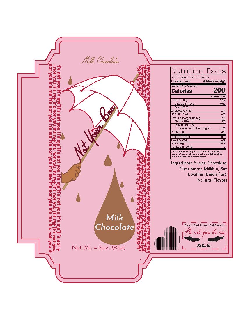
Custom chocolate bar wrapper artwork featuring dielines, fold specifications, and coordinated graphics designed to maintain consistency across the collection.

Mockup by Zippypixels
A collection of chocolate bar packaging mockups showcasing the Not Your Boo identity across multiple products, combining playful messaging with a cohesive visual presentation.
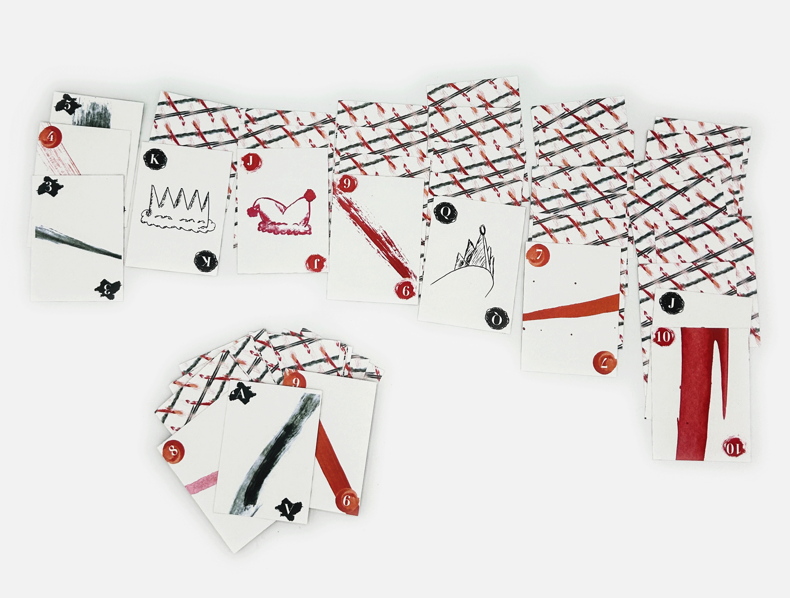
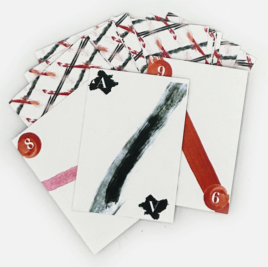
A reinterpretation of traditional playing cards that combines the classic red-and-black color scheme with four distinct artistic mediums, assigning each suit its own medium and each card a unique brushstroke. Design Concept A playing card collection exploring the relationship between traditional card design and artistic expression through four distinct mediums. Card Development Each suit represents a different artistic medium, with individual brushstrokes creating unique compositions while maintaining a cohesive visual identity across the deck. Final Collection A complete playing card collection that balances traditional suit recognition with expressive artwork, unifying different artistic techniques through a consistent red-and-black palette.
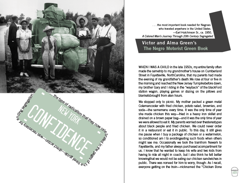
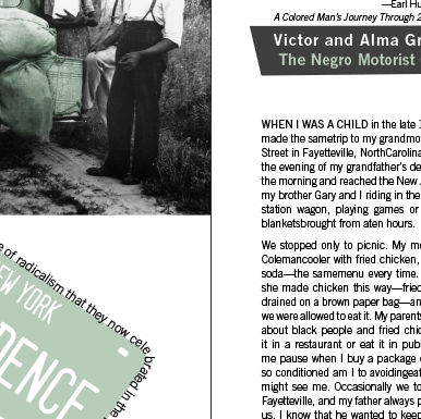
An editorial spread designed for Chapter 7 of The Green Book, exploring the relationship between typography, visual hierarchy, and page composition. The design uses thoughtful spacing, type placement, and layout to create an engaging chapter introduction while maintaining readability and visual balance.
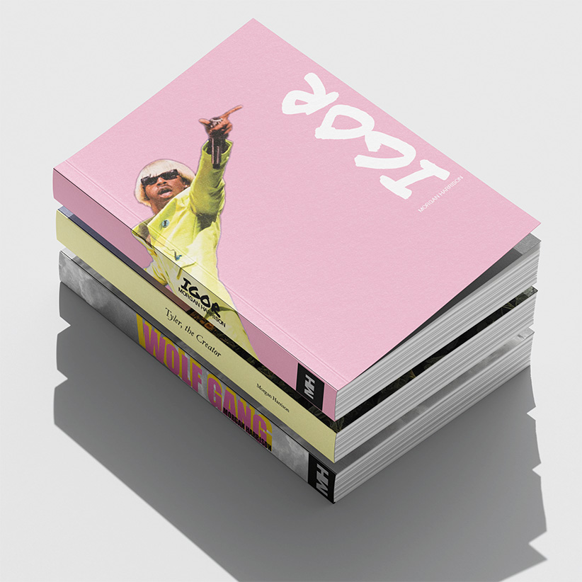
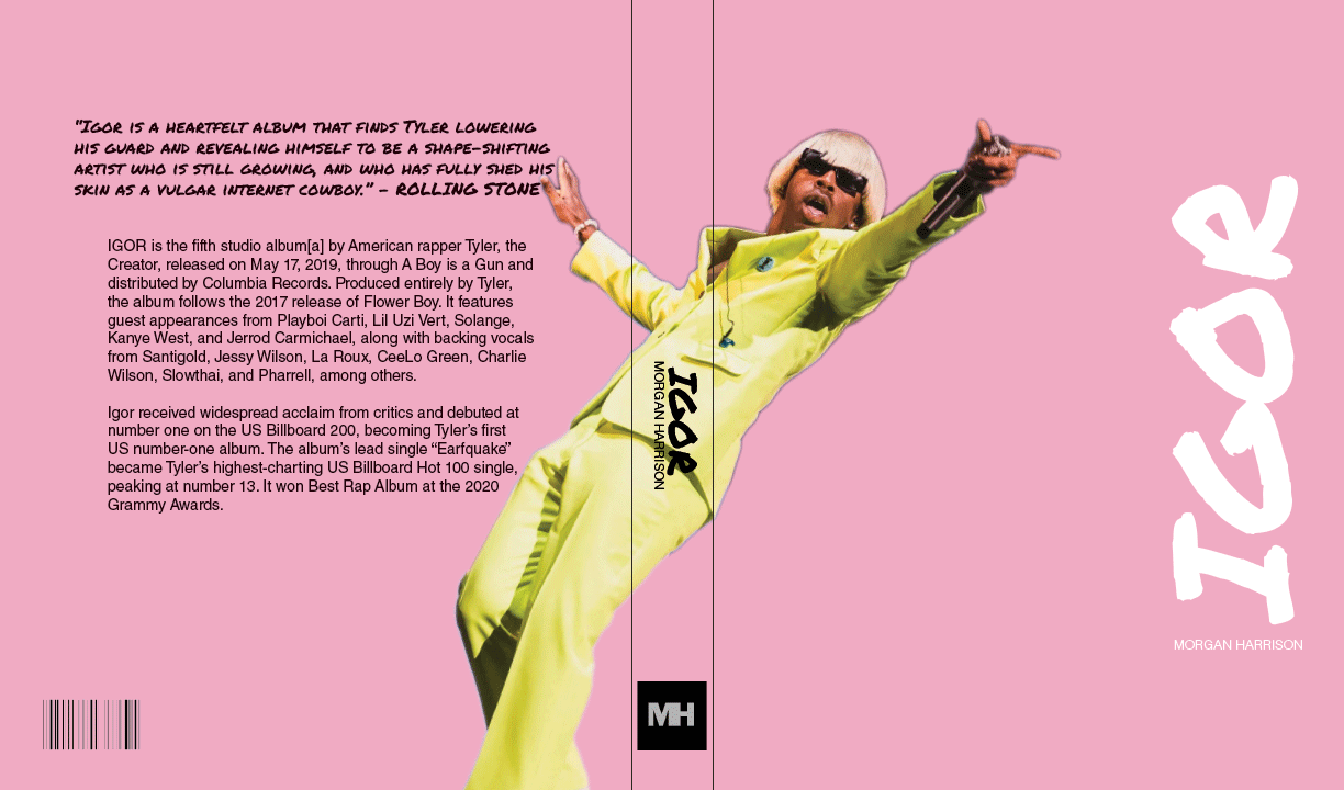
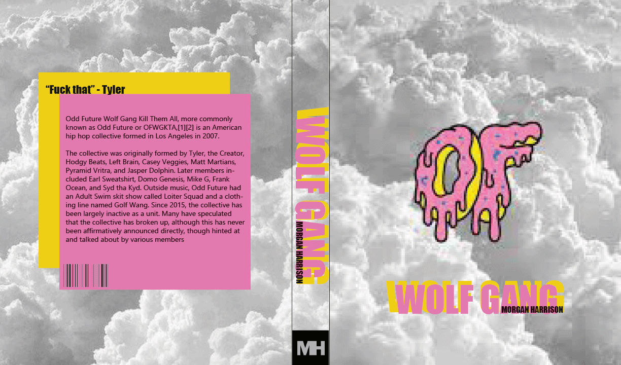
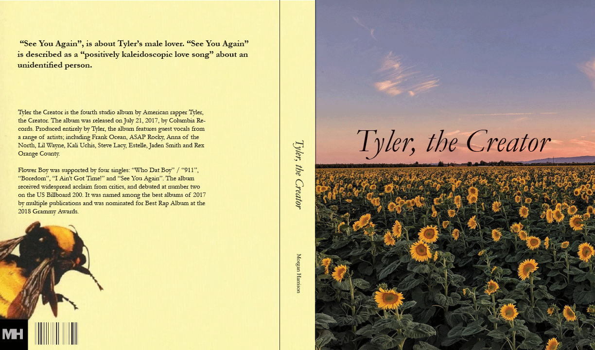
A collection of three book cover designs exploring the artistic identity and creative influence of Tyler, the Creator. Each cover presents a distinct visual interpretation of the musician, using typography, imagery, and composition to establish a unique identity while maintaining a cohesive editorial approach.
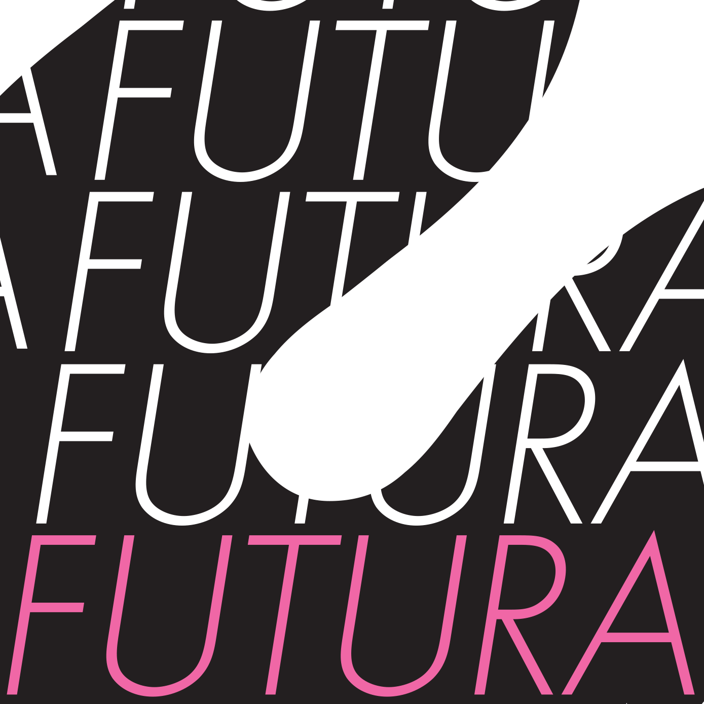
An experimental typography poster exploring the geometric characteristics of the Futura typeface. The composition emphasizes letterforms, curves, and negative space through oversized typography and knockout techniques, highlighting the typeface's distinctive visual structure.
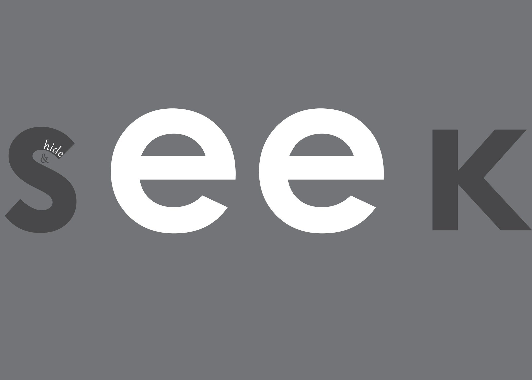
An experimental typography project exploring the relationship between letterforms, visibility, and negative space. Through creative type placement and composition, the design interprets the concept of hide and seek, encouraging viewers to discover typography within the artwork.
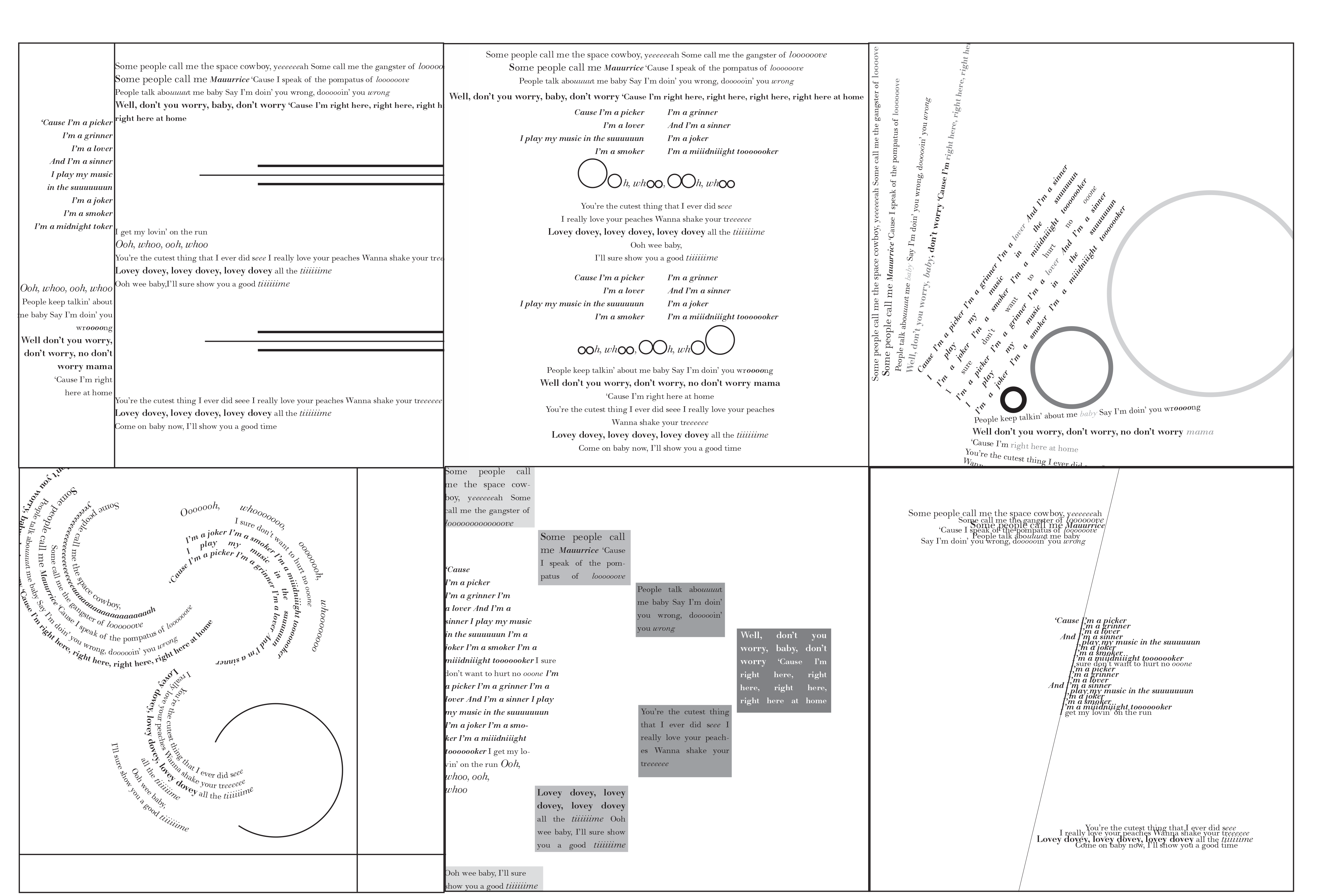
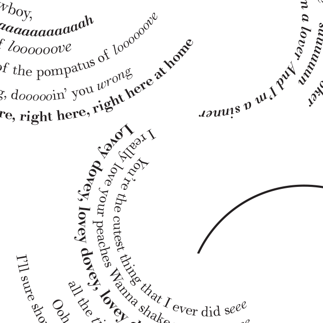
A series of six typographic compositions inspired by “The Joker” by the Steve Miller Band. Drawing on the song's playful lyrics and retro 1970s atmosphere, the designs explore how typography, color, and composition can visually communicate the personality, rhythm, and mood of music.
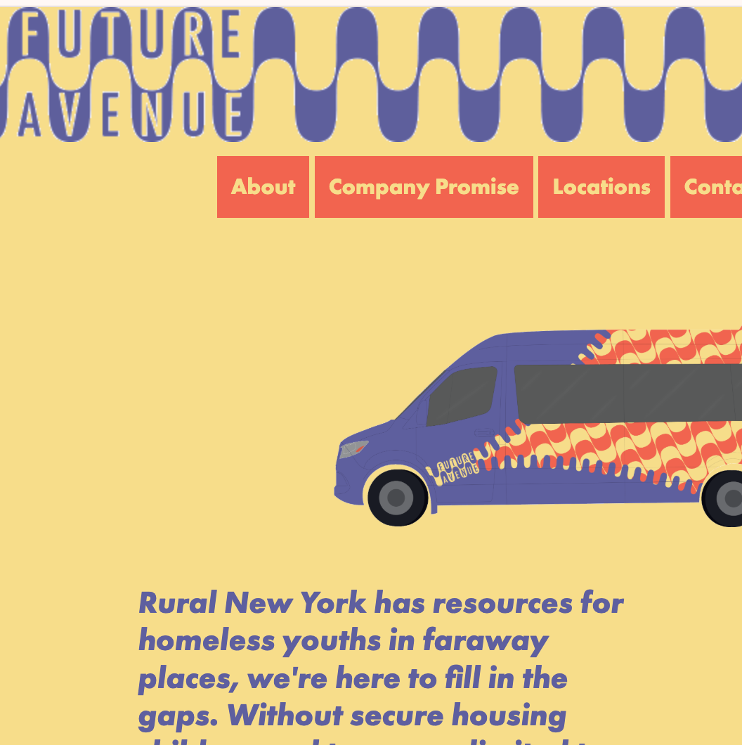
An interactive website concept developed for Future Avenue, a transportation service supporting homeless and at-risk youth in rural communities. The website extends the brand identity into a digital experience through custom graphics, animation, interactive navigation, and informational content.
Explore the original Future Avenue website directly within this portfolio. The interactive preview demonstrates the website's layout, navigation, custom illustrations, and animated elements.
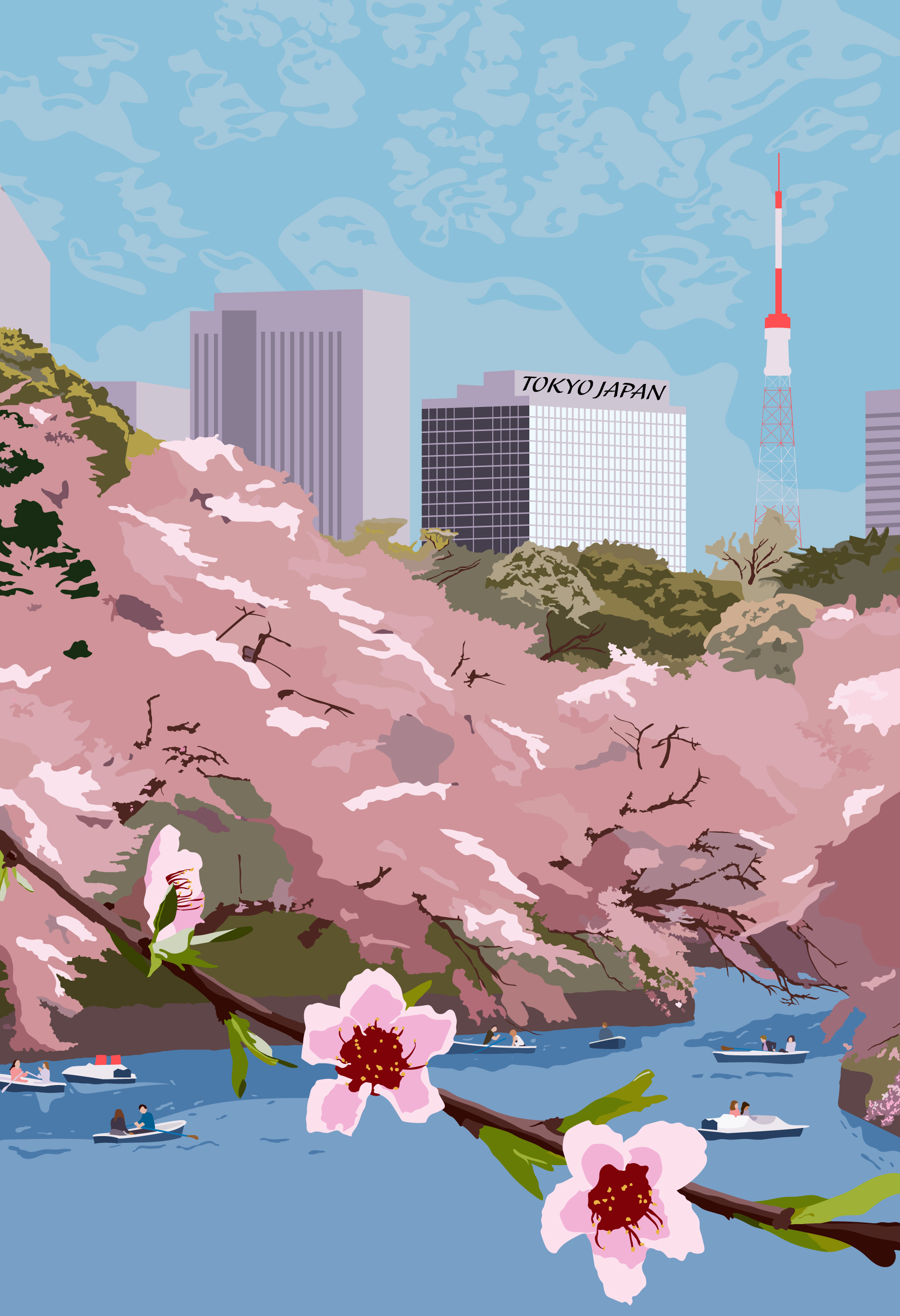
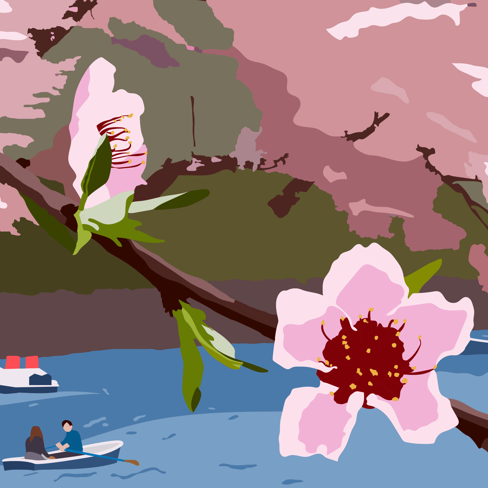
A conceptual poster inspired by Tokyo, Japan, exploring the city's distinctive visual culture and urban energy. The design combines illustration, typography, and composition to create a visually engaging interpretation of the city.